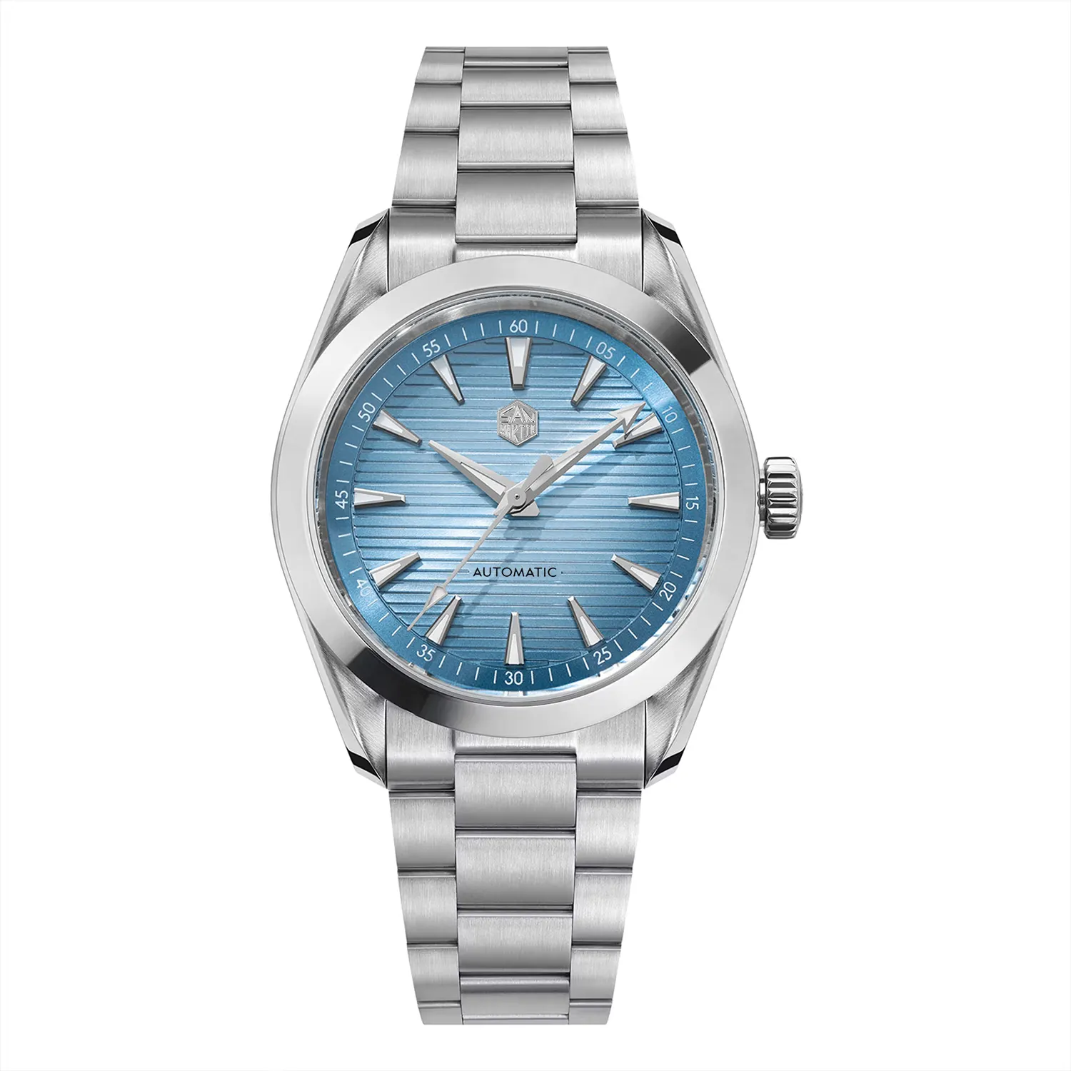

A watch can look familiar without being a copy of one particular object. It can also assemble familiar details in a way that feels distinctive. Discussions about ‘original’ Chinese watches often get stuck at the label: either a design qualifies or it does not. The linked enthusiast thread shows the appetite for something with its own identity. To evaluate that identity, look more closely than the label allows.
Take the Watchdives WDC0001 Premier. Its integrated silhouette, dark dial treatment and compact proportions make a useful design case study. The catalogue can establish its dimensions and movement. It cannot measure originality as a percentage, or prove that every visual association a viewer makes was intended by the designer. Those are different sorts of claims, and confusing them turns criticism into guesswork.
Describe the decisions, then make the judgement
Begin at the outline. How does the case meet the bracelet or strap? Is the transition a continuous line, a visible joint or a deliberately abrupt change? Look at the dial next: the spacing of the markers, the relative weight of the hands, the amount of empty surface and the way the crystal changes the view at an angle. Then consider proportion. A distinctive colour alone may make a watch memorable; a distinctive set of proportions makes it recognizable even in a silhouette.
The San Martin SN0113W V2 offers a different exercise: a conventional round everyday format. Familiarity is not a flaw in itself. A watch can use a well-established format and still be coherent, comfortable and appealing. The meaningful question is whether its individual choices work together, and whether you like the result on your wrist. A design need not shock you to merit attention.
When discussing influence, name what you can observe: a broad bezel, a particular hand shape, a cushion case, a dial layout. If you make a historical claim about who introduced a feature, it needs a reliable source and a clear reason to be in the article. Community comparisons can help readers describe their reactions, but they remain attributed opinions. Watchio’s design language should make a watch easier to understand, rather than turn an unverified association into a catalogue fact.
The practical payoff is better buying. If a design attracts you because of its dark, uninterrupted dial, inspect legibility in ordinary light. If it attracts you for the case shape, check how that shape sits on your wrist. If what you admire is a familiar format, compare the details you will touch and read each day. ‘Original’ is a conversation starter. The visible decisions are what you will live with.
There is room for disagreement here. Two readers can observe the same bezel and handset and reach different conclusions about their combined effect. A useful review should give each reader enough description to make that judgement independently. That is more honest than pretending a single verdict about originality can be verified in the way a case measurement can.